
Beautiful Feet of Chandler is a religious non-profit ballet company.
The brand program we created was an ambitious approach, intended to demonstrate the artistry and focus of their creative talent.
Agency: Reinecke Design
Client: Beautiful Feet of Chandler
Renaming/Brand Strategy: Chris Reinecke
Creative Direction: Chris Reinecke
Stock Images: Adobe Stock,
Envato Elements, MorgueFile
Client: Beautiful Feet of Chandler
Renaming/Brand Strategy: Chris Reinecke
Creative Direction: Chris Reinecke
Stock Images: Adobe Stock,
Envato Elements, MorgueFile
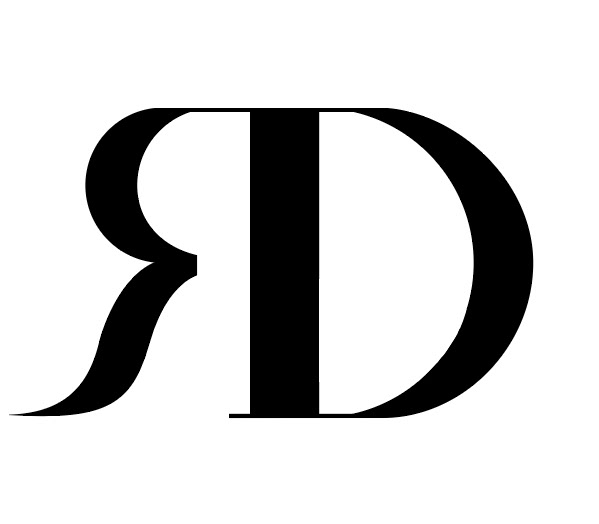
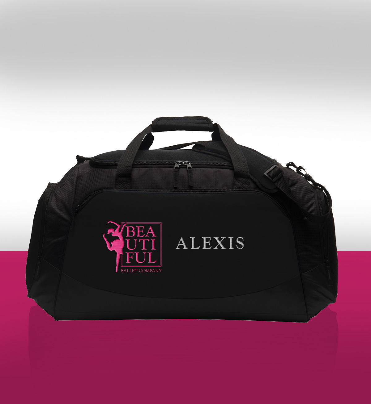
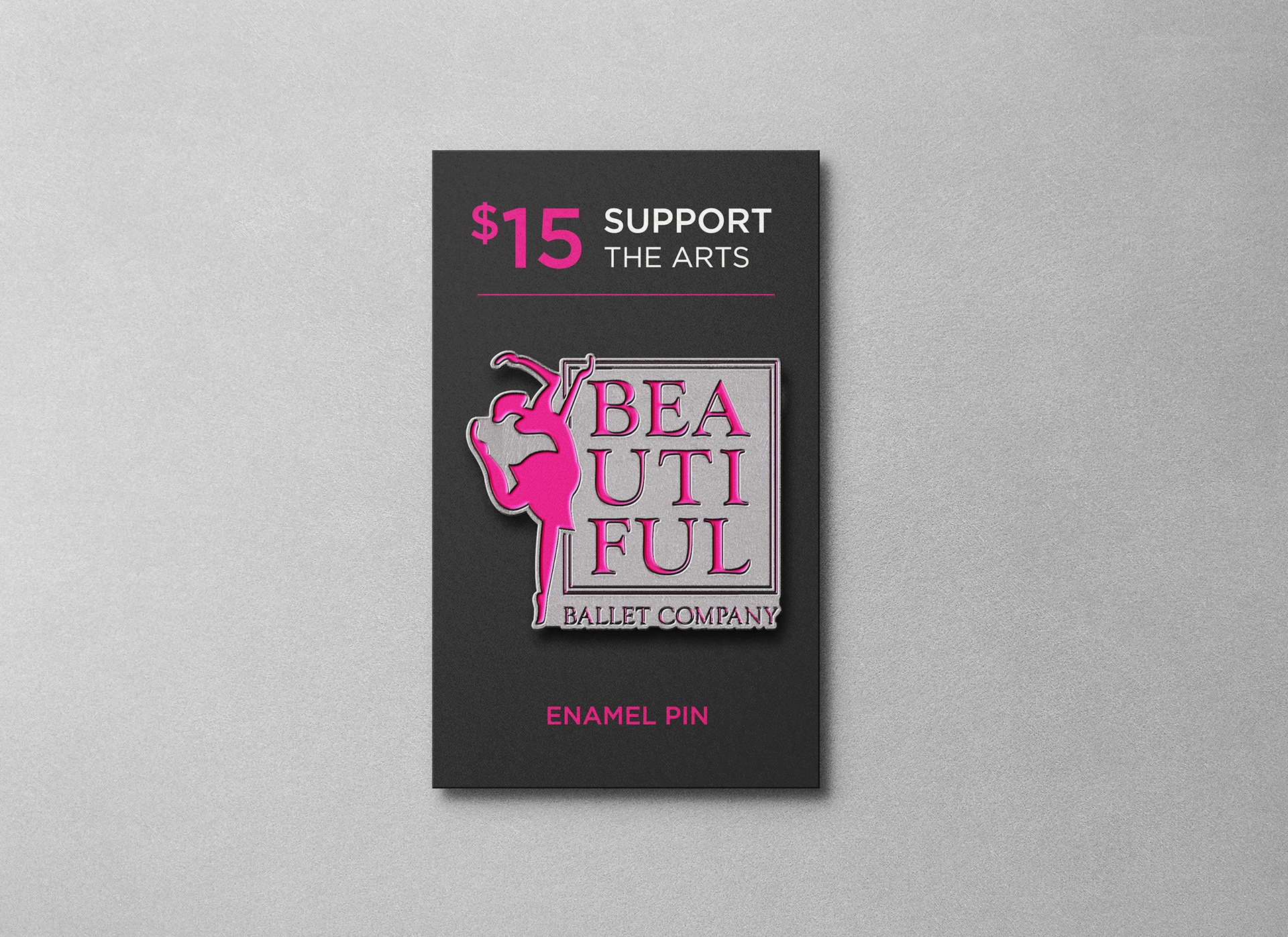
Beginning with the name, we suggested a slight modification to avoid unwanted attention. "Beautiful Feet" of Chandler would become "Beautiful Ballet Company."
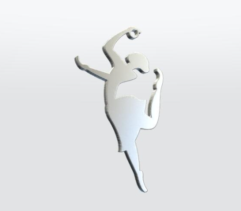
This change would move the religious affiliation out of the name, into the logomark itself, with a dove appearing in the negative space.
This change would move the religious affiliation out of the name, into the logomark itself, with a dove appearing in the negative space.
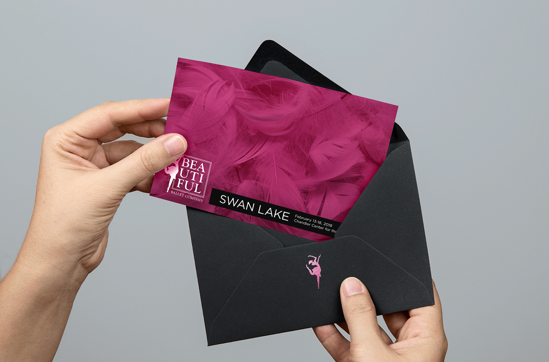
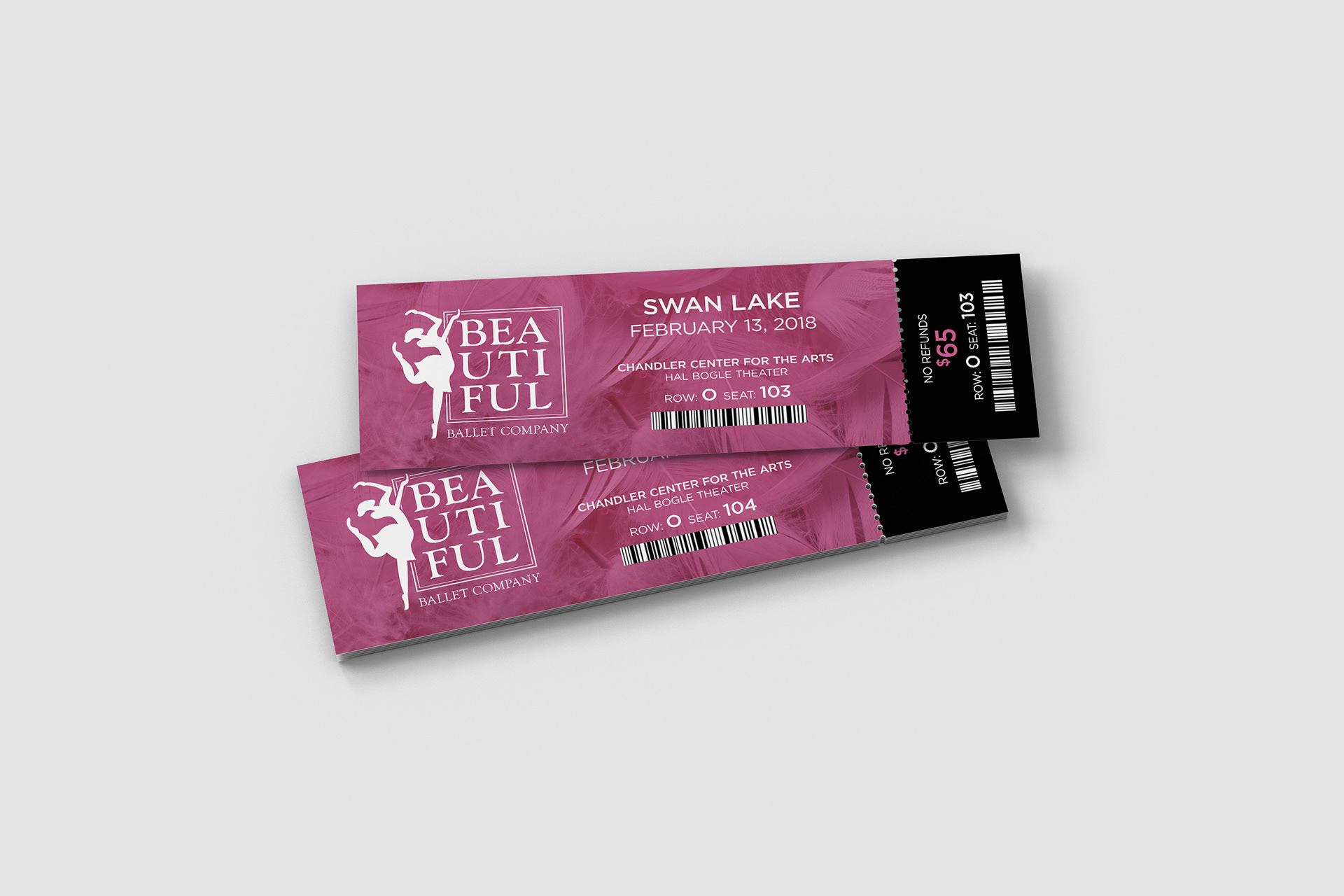
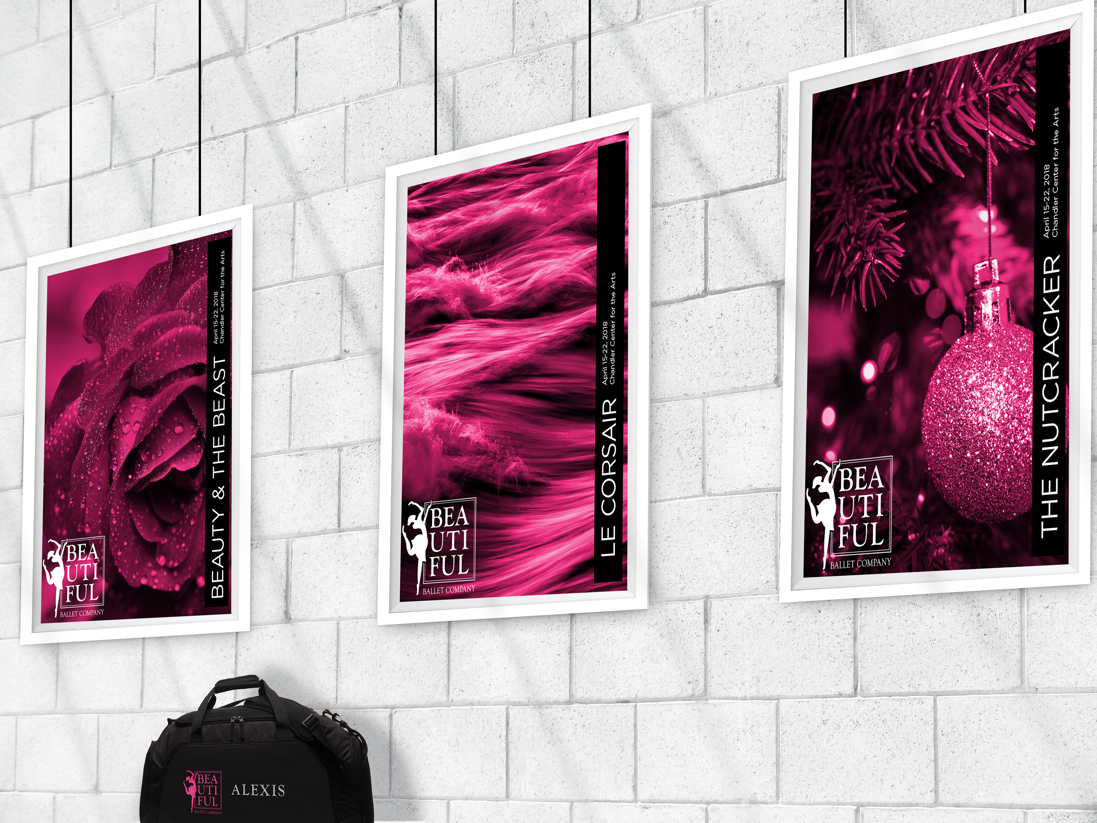
To capture the spirit of bold artistry with a feminine touch, we selected a bright magenta, to stop viewers in their tracks.
To apply the identity to playbills, posters and other performance marketing, we recommended abstract photo selections from stock services.
To apply the identity to playbills, posters and other performance marketing, we recommended abstract photo selections from stock services.
This approach would help protect the performers and reduce the need for expensive photography services, while allowing the company to demonstrate its creative side.